
Intro section
Elitic needed a website that could make the program feel clear, safe, and genuinely appealing to students before asking for commitment.
The project combined research, copywriting, tone of voice development, and website implementation to create a digital experience that feels more relevant to how students actually decide, explore, and engage.
Client Background
Elitic is a program for high school students built around communication, growth, competitions, and a sense of belonging. The website needed to reflect that without sounding institutional, overly polished, or intimidating.
Project Objective
The goal was to create a website that connects faster with the right students, communicates the experience more clearly, and removes friction from both exploration and sign-up.
Research and Strategic Grounding
Before shaping the messaging, we looked at what actually attracted students who were already part of Elitic.
This included conversations with students already in the program, focused on what caught their attention before they fully understood what Elitic was, as well as direct observation of what happened during live group trainings.
What We Needed to Understand
The research helped clarify what matters most in the first impression:
curiosity, belonging, energy, confidence without pressure, and a sense that this is a place where you can grow without needing to already “be impressive.”
Strategic Direction
That gave us a stronger foundation for both the copy and the structure of the site. Instead of presenting Elitic in a formal or overly explanatory way, the website needed to feel immediate, human, and easy to connect with.
Copywriting and Tone of Voice
A big part of the work was shaping a tone that speaks to students in a way that feels credible and inviting, without becoming childish, performative, or overly aspirational.
The website needed to communicate ambition carefully: enough to feel exciting, but grounded enough to feel safe and accessible.
Approach
The copy was built to reduce distance between the program and the student reading about it for the first time.
That meant:
-
clearer language
-
more natural emotional cues
-
less institutional phrasing
-
stronger connection between sections
-
a better balance between inspiration and clarity
Message Structure
Instead of relying on generic “education” language, the messaging was written to show what Elitic feels like in practice:
community, confidence, challenge, expression, and momentum.
Website Structure
The website was implemented to support the new communication direction through a more engaging and better-paced digital experience.
The goal was not just to place content on a page, but to shape how users move through it: what they notice first, what keeps them engaged, and what helps them keep going.
User Flow
The structure was refined to help visitors move naturally through the story of the program:
from interest -> to understanding -> to trust -> to action.
Section Planning
Each part of the website had to do a clear job, whether that meant building emotional connection, showing social proof, explaining the process, or making the next step feel lighter and easier.
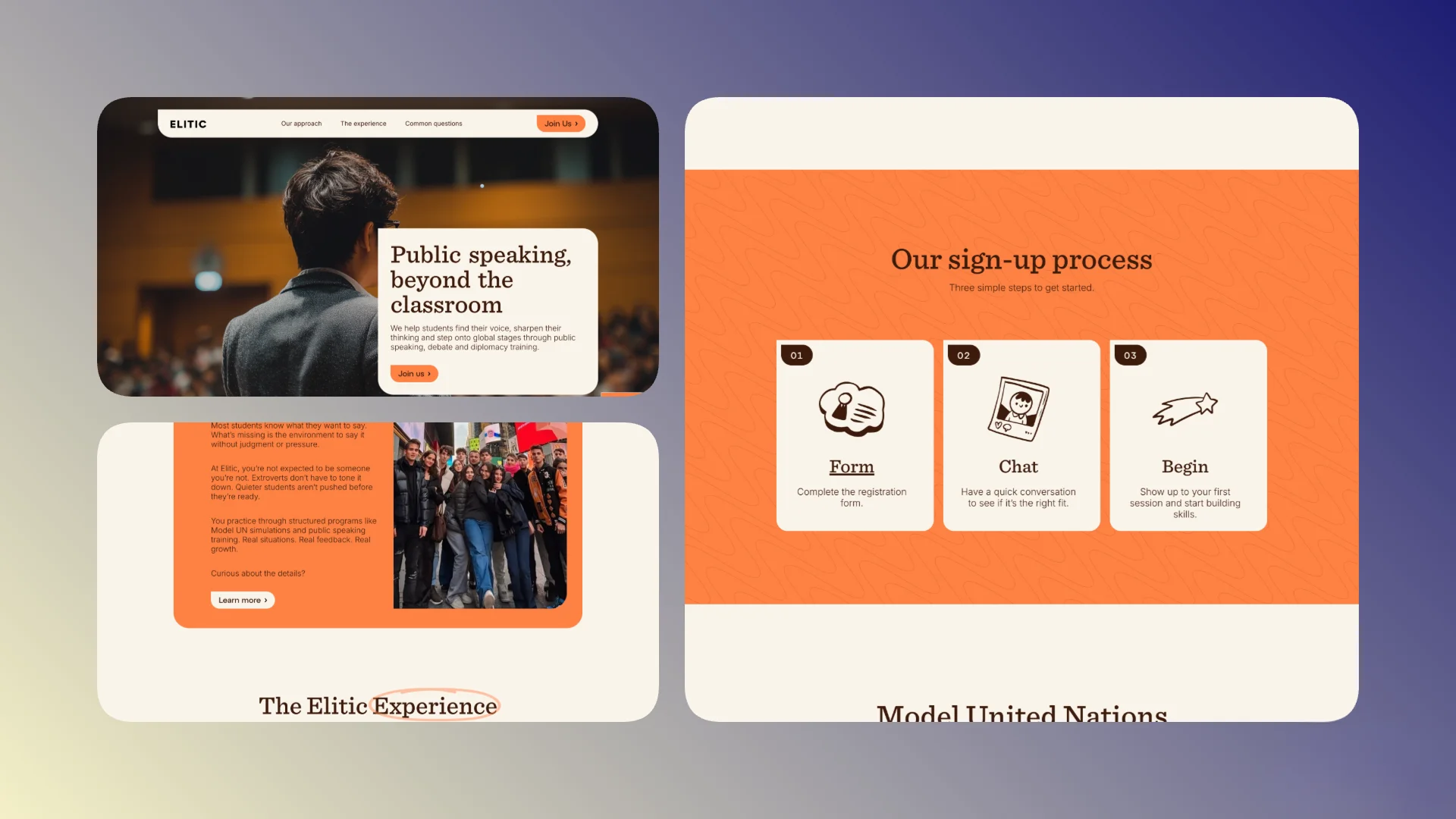
Form Optimization
One of the important improvements was simplifying the form structure.
The previous version created too much friction. The new flow was designed to reduce effort, make the process feel lighter, and improve the chances that interested students actually complete the step.
Why It Matters
For this kind of audience, even small points of friction can create hesitation.
By shortening and clarifying the form experience, the site supports action at the right moment instead of losing users after interest is already there.
Motion and Interaction
Animations were implemented to support rhythm, attention, and overall page feel.
Used well, motion helps the site feel more alive and memorable, especially for a younger audience that responds quickly to tone, pacing, and interaction quality.
Role of Motion
Here, animation was not decorative for its own sake. It helped:
-
guide attention
-
support transitions between sections
-
make the experience feel more dynamic
-
reinforce the emotional tone of the brand
Communication and Conversion
A strong part of the project was making sure the site communicates value before asking users to understand everything in detail.
Students often respond first to feeling, tone, and relevance. The website needed to meet them there before moving into explanation.
Lower Friction, Better Engagement
By combining stronger copy, clearer flow, more relevant tone, and a simpler sign-up structure, the site now supports engagement in a more natural way.
The experience feels easier to enter, easier to follow, and more aligned with the audience it is meant to attract.
Process
The project brought together research, messaging, and implementation rather than treating them as separate layers.
That allowed the website to feel more coherent from top to bottom, with the structure, wording, and interaction style all supporting the same goal.
Delivery Focus
We focused on the parts that create the most value for this type of program:
-
stronger relevance for students
-
more emotionally accurate communication
-
better pacing across the site
-
lower friction in the sign-up journey
-
a more engaging digital experience overall
Expected Result
The site needed to do more than explain the program.
It had to make Elitic feel approachable, exciting, and worth exploring further, while still giving enough structure and clarity to support trust from both students and parents.
In Practical Terms
That meant a website that:
-
connects faster with the right audience
-
communicates the experience more clearly
-
feels aligned with the real atmosphere of the program
-
keeps users engaged longer
-
reduces friction in sign-up
-
supports stronger conversion from interest to application
Outcome
Elitic now has a website experience that better reflects the energy, clarity, and emotional reality of the program.
The combination of research-based messaging, more intentional structure, animation, and improved form flow creates a stronger connection with prospective students and supports a smoother path from curiosity to action.
What Improved
The work strengthened:
-
tone of voice consistency
-
message clarity
-
emotional relevance for the audience
-
engagement through interaction and pacing
-
sign-up flow usability


